How to Design a Shop Sign That Can Be Read at a Glance
Good shop sign design is not about squeezing as much information as possible onto a fascia.
It is about making sure somebody approaching your premises can understand who you are and what you do within a few seconds.
That sounds simple, but many shop signs make the same mistakes: lettering that is too small, weak colour contrast, excessive wording or logos that become difficult to recognise from across the road.
A strong sign should look good close up, but it should also work from the pavement, from a passing car and in poor weather or low light.
If you’re investing in new signage, these are the most important design principles to get right.
[INTERNAL LINK → Shop Signage page | Anchor text: professional shop signage]
1. Make the Business Name the Main Focus
Your business name should normally be the most prominent element on the sign.
Customers should not have to search for it among telephone numbers, web addresses, slogans and service lists.
A clean hierarchy usually works best:
Business name first.
Then, if required, a short line explaining what you do.
For example:
HARRISON & CO
Estate Agents
is much easier to understand than:
HARRISON & CO – SALES – LETTINGS – VALUATIONS – PROPERTY MANAGEMENT – CALL US TODAY
The second version may contain more information, but that does not make it more effective.
A shop fascia is not a leaflet.
Its first job is identification.
2. Keep the Wording Short
One of the most important rules of shop sign design is to remove anything that does not need to be there.
People often see shop signage while walking or driving past. They may only have a few seconds to process it.
That means shorter messages are usually stronger.
A sign might need:
Business name
What the business does
One useful point of contact
It usually does not need every service you provide.
If a customer wants more information, your window graphics, website, posters or printed marketing can explain the rest.
Think in seconds, not minutes
Ask yourself:
If someone saw this sign for three seconds, would they understand the business?
If not, simplify it.
3. Choose Lettering That Is Easy to Read
Typography has a huge effect on shop signage design.
A highly decorative font might look attractive on a business card but become difficult to read when manufactured at large scale and viewed from a distance.
Simple, strong lettering is usually easier to recognise quickly.
That does not mean every sign needs to use the same basic font.
The aim is to choose typography that reflects the brand without sacrificing legibility.
For example:
A luxury salon may use elegant lettering, but it still needs enough weight and spacing to remain visible.
A trade counter may benefit from heavier, more direct typography.
A children’s business can use something more playful, provided the words remain clear.
Avoid using several different fonts unless there is a strong reason.
One main typeface with a complementary secondary style is usually enough.
[IMAGE PROMPT]
Visual Concept: Side-by-side comparison of two fictional UK shop fascias. The first has small decorative lettering, several fonts and too much wording. The second uses large clear lettering, one strong business name and a short service description. Show both from across the street so the readability difference is obvious.
SEO Alt Text: Shop sign design comparison showing clear and difficult-to-read shop signage
4. Use Strong Colour Contrast
Even perfectly chosen lettering can disappear if there is not enough contrast between the text and background.
High contrast makes signage easier to read.
Think:
White lettering on dark blue
Black lettering on white
Bright lettering against a deep fascia colour
rather than two similar shades competing with each other.
Your brand colours still matter, but they need to work in the real environment.
A colour combination that looks good on a laptop screen may not be as effective on a fascia viewed from 20 metres away.
Consider the surrounding building
The shopfront itself also affects the design.
If the building is dark brick, a dark fascia may need brighter lettering to stand out.
If neighbouring businesses use very bright signage, a simpler high-contrast design may actually attract more attention than adding even more visual noise.
Good shop front sign design should respond to the building rather than being created in isolation.
5. Give Letters and Logos Enough Space
Crowded signage is harder to read.
Letters need enough space around them to remain distinct, particularly when viewed from a distance.
The same applies to logos.
A common mistake is making the logo, company name and supporting text as large as physically possible until everything nearly touches the edge of the fascia.
Leaving clear space can make the sign look more premium and easier to understand.
Don’t stretch the logo to fill the fascia
If your logo is naturally square but the sign is long and narrow, stretching it across the entire width will damage the proportions.
A better layout might use the logo to one side and the business name alongside it.
This is one reason professional sign design should start with the shape of the actual shopfront, not simply the logo file.
6. Design for the Real Viewing Distance
A sign can look perfectly readable while you’re standing one metre away from a computer monitor.
That is not how customers see it.
Before approving a shop fascia design, think about where people will actually be.
Will they see it:
From the opposite pavement?
From a car?
From the end of the street?
From directly underneath it?
The further the viewing distance, the more important letter size, simplicity and contrast become.
This is especially important for businesses positioned on busy roads.
A sign that relies on small text may work for pedestrians but be almost useless to passing traffic.
Photograph the premises before designing
A good photograph of the full shopfront helps establish:
- Fascia proportions
- Viewing angles
- Surrounding colours
- Nearby signage
- Obstructions
- Sign height
Designing onto a photograph also makes it much easier to visualise how the finished sign will actually look.
[IMAGE PROMPT]
Visual Concept: Show the same fictional shop sign at three viewing distances: close-up, across the pavement and from across the road. Demonstrate how small secondary text becomes unreadable while the main business name remains clear. Use measurement markers subtly.
SEO Alt Text: Shop signage design tested at different viewing distances
7. Think About Day and Night
If your business trades after dark, your sign needs to work in both daylight and evening conditions.
This does not always mean making the whole fascia illuminate.
Options can include:
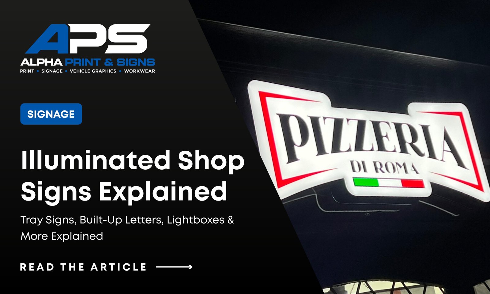
Face-lit lettering where the front of the letters illuminates.
Halo-lit lettering where light creates a glow behind the characters.
Illuminated lightboxes where a larger area of the sign lights up.
Trough lighting where external lights illuminate a conventional fascia.
The lighting method should support the design rather than overpower it.
A very bright sign is not automatically easier to read.
Good business sign design relies on clear typography and contrast first, with illumination adding visibility after dark.
[INTERNAL LINK → Illuminated Shop Signs article | Anchor text: types of illuminated shop signs]
What Should Go on a Shop Sign?
In most cases, less is better.
A strong fascia may only need:
| Element | Priority |
|---|---|
| Business name / logo | Essential |
| Short description | Useful if the name does not explain the business |
| Telephone number | Optional |
| Website | Optional |
| Social media handles | Usually better elsewhere |
| Long service list | Avoid on the main fascia |
Windows, projecting signs and printed material give you additional places to communicate.
The main fascia should remain clear.
Should You Design the Sign Yourself?
You can provide your own artwork, particularly if your business already has established branding.
But creating signage is slightly different from designing for social media or print.
The designer needs to consider:
- Actual fascia dimensions
- Manufacturing methods
- Letter thickness
- Fixing positions
- Materials
- Illumination
- Viewing distance
- Building colour
- Installation restrictions
A design may look great on screen but be expensive, difficult or impossible to manufacture exactly as shown.
This is where combining sign design and production becomes useful.
The design can be developed around materials and manufacturing methods from the start, rather than creating artwork first and working out how to build it afterwards.
From Shop Sign Design to Finished Installation
At Alpha Print & Signs, we can help take a project from the initial shopfront photograph through to the finished sign.
That can include:
Design → Artwork → Manufacturing → Installation
Depending on the premises, the finished sign could include:
- Aluminium sign trays
- Flat-cut letters
- Built-up lettering
- Illuminated letters
- Lightboxes
- Projecting signs
- Window graphics
The best solution depends on the building, budget and the appearance you’re trying to achieve.
[INTERNAL LINK → Shop Signage page | Anchor text: shop sign design and installation]
[IMAGE PROMPT]
Visual Concept: Three-stage professional graphic showing the process from an original photograph of a plain UK shopfront, to a digital shop sign design mock-up, to the finished installed fascia. Use exactly the same building in all three stages and Alpha Print & Signs branding.
SEO Alt Text: Shop sign design process from visual mock-up to finished installation
Get Your Shop Sign Designed by Alpha Print & Signs
A successful shop sign design should make your business easier to recognise, not harder.
Clear lettering, strong contrast, sensible spacing and the right amount of information can make a much bigger difference than adding more colours, more text or more complicated graphics.
If you’re planning a new shopfront, send Alpha Print & Signs:
A photograph of the premises, your logo, approximate fascia dimensions and any sign styles you like.
We can then look at the design and recommend a signage construction that works for both the building and your budget.
[PRIMARY CTA BUTTON: GET A SHOP SIGNAGE QUOTE]
[SECONDARY CTA BUTTON: VIEW SHOP SIGNAGE]
[INTERNAL LINK → Contact / Quote page | Anchor text: request a shop sign design quote]
Frequently Asked Questions
What makes a good shop sign design?
A strong shop sign is easy to understand quickly. It normally uses a clear business name, readable lettering, strong colour contrast and enough spacing around each element.
How much information should be on a shop fascia?
Usually less than many businesses expect. Focus on the business name and a short explanation of what you do if necessary. Additional information can be placed on windows, posters or other signage.
What font is best for a shop sign?
There is no single best font. The priority is choosing typography that matches your branding while remaining easy to read from the expected viewing distance.
Should my telephone number be on the shop sign?
It can be, particularly for service businesses, but it should not compete with the business name. If adding it makes the fascia overcrowded, the telephone number may work better on window graphics.
Can Alpha Print & Signs design my signage as well as manufacture it?
Yes. Combining the shop sign design, production and installation stages helps ensure the artwork is created around the actual building and intended manufacturing method rather than designing something that later needs major changes.